FIRST BUS YORK
Park & Ride Campaign
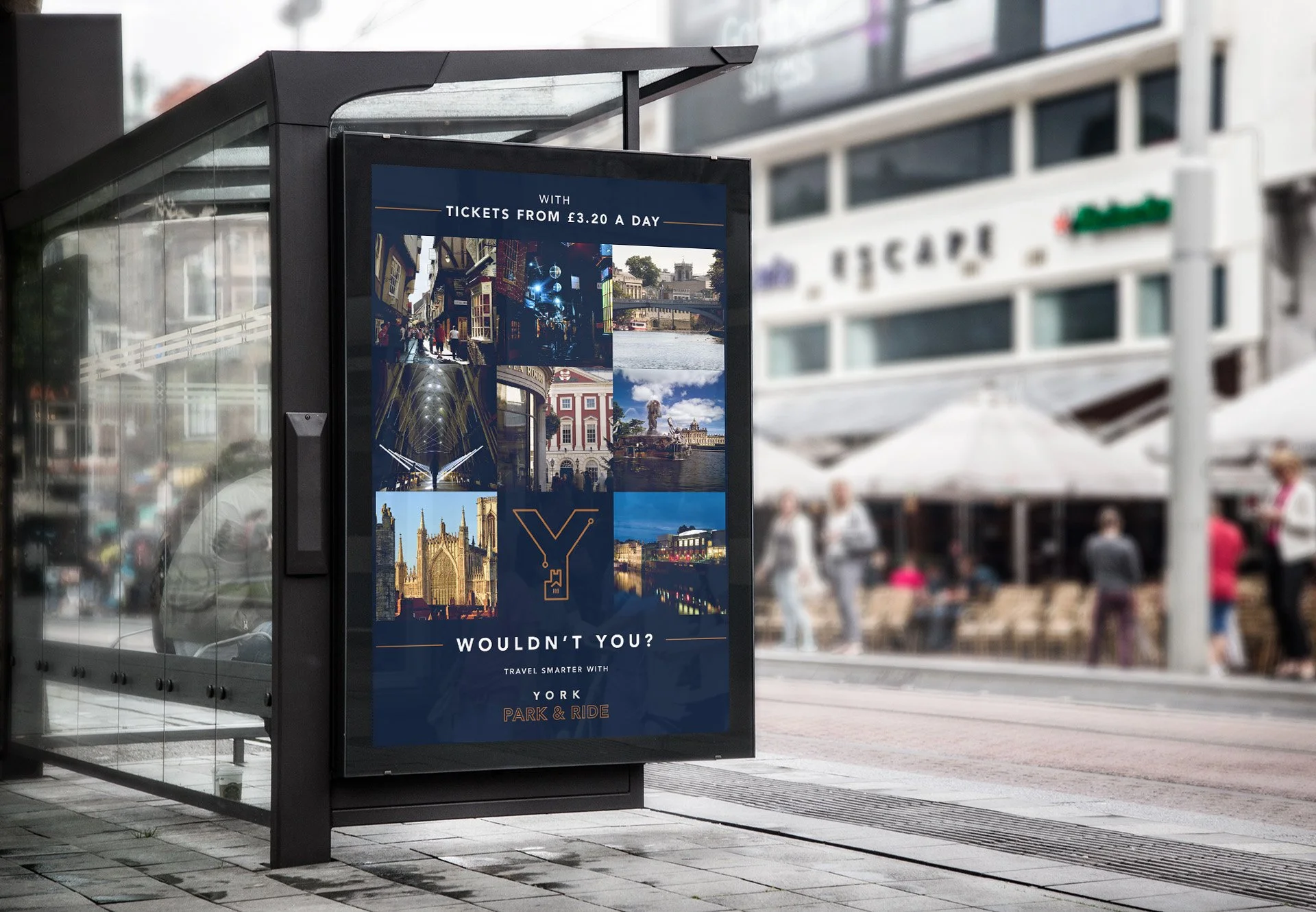
First Bus York launched a campaign to promote its new park-and-ride facilities, an upgraded fleet of electric vehicles, and affordable fares.
The creative team developed a cohesive campaign identity and strategy, ensuring consistency across three key rollout phases. Central to the campaign was the tagline ‘Y wouldn’t you?’, using the iconic ‘Y’ to engage the audience and drive consideration of the new services.
The campaign included variations tailored for specific objectives. The awareness phase introduced the identity, highlighting the service’s benefits. The visuals took inspiration from the electric fleet’s livery, featuring a regal navy palette complemented by gold and copper accents. This polished aesthetic reflected a modern, sophisticated brand, reinforcing the campaign's impact.
My role: Senior Creative
Creative Agency: Brass


